Appendix A — Appendix
A.1 Nonlinear Combustion Dynamics at Reduced Speeds
Because our model captures combustion dynamics defined across different engine loads and operational phases, the increase in emissions inside the VSR zones during the season may reflect changes in combustion characteristics at different speeds, which in turn translate into differences in exhaust residuals.
Below, we examine the relationship between emissions and emission intensities with vessel speed to assess whether the increase in certain pollutants within the VSR area and season correspond to actual engine dynamics.
A.1.1 Vessel-level relationship
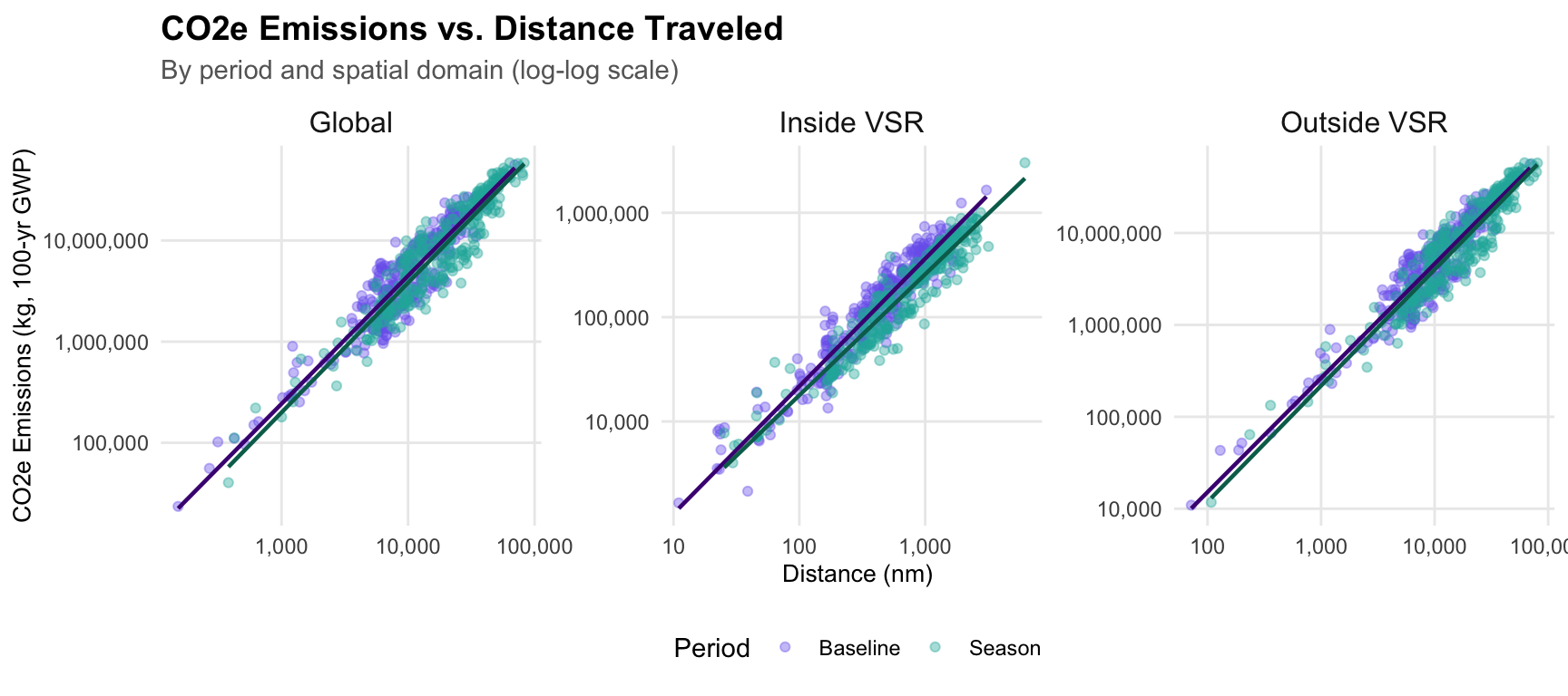
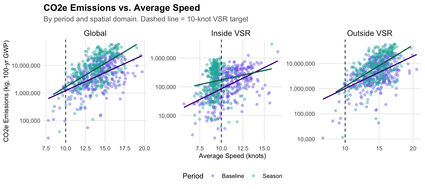
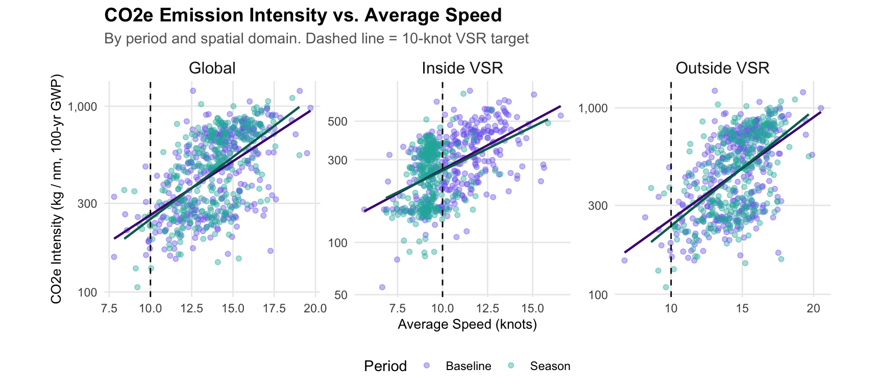
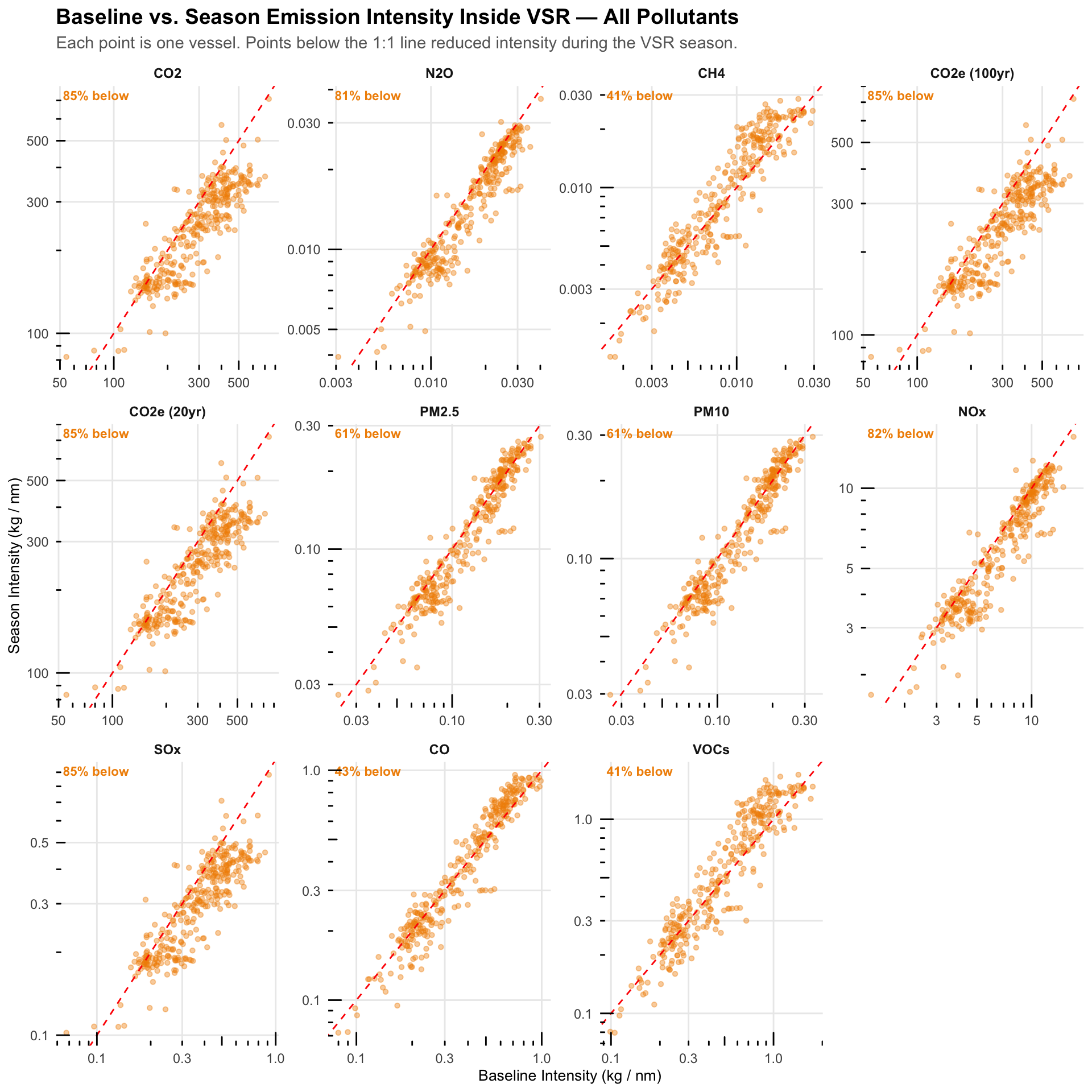
First, we examine the highest aggregated level of the metrics of interest, up to the vessel level, which is the level used to calculate the intensities that define the counterfactual emissions. We find no unexpected deviations from the linear relationship between emissions and distance (Figure A.1). This, by extension, doesn’t introduce much change to the patterns observed between emissions vs average speed with respect intensity vs average speed (Figure A.2 and Figure A.3).
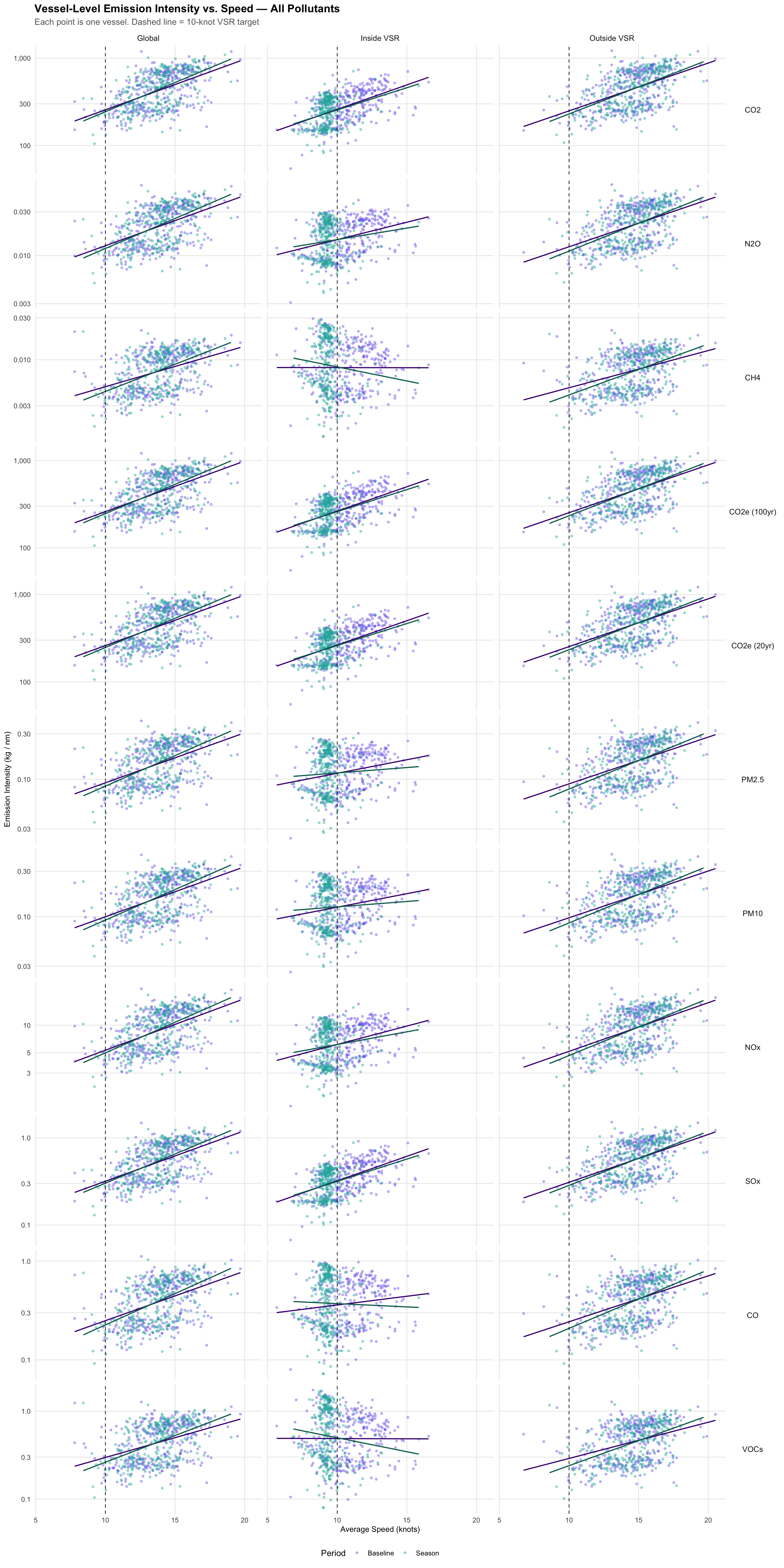
With this, we can extend the analysis by focusing on emission intensities for all other pollutants. In Figure A.4, we observe that at the global level and outside the VSR, the relationships, although weak, are positive, with higher intensities associated with higher speeds. In contrast, within the VSR the linear relationship gets weaker and becomes virtually null or negative for some pollutants during the season.
Although the weak association prevents us from defining a clear overall trend, it helps identify two main patterns. Specifically, CH4 and VOCs do not show the clear positive relationship observed for other pollutants during the baseline inside the VSR. These are followed by CO, which shows a positive but less steep slope compared to the others. This distinction is also visible in Figure A.5, where CH4, VOCs, and CO show higher seasonal intensities than baseline intensities inside the VSR, while the opposite holds for the remaining pollutants. This helps explain why emissions of the former increase inside the VSR, whereas emissions of the latter group decrease.
This pattern is consistent with the low-load adjustment factors reported in Table 20 of the Fourth IMO GHG Study (Faber et al. 2020) and extended in Table 3.10 of the EPA’s Port Emissions Inventory Guidance (U.S. Environmental Protection Agency 2020), as used in our model. For CO2 and SOx, the low load adjustment factors are equal to 1 across all engine load levels (Table A.1), meaning their emissions scale directly with fuel consumption and are not penalized by inefficient combustion at low loads. In contrast, the other pollutants have adjustment factors greater than 1 at low engine loads (< 20%), reflecting the increase in incomplete combustion byproducts when engines operate well below their optimal design capacity, with the largest increases observed for CH4 and VOCs, followed by CO.
While the hypothesis of load adjustment factors emerges as a plausible explanation, the current aggregation at the vessel level excessively smooths the underlying trends. By aggregating trips, and before aggregating ping level emissions and intensities, we may be masking the actual trends in these relationshisp that would allow us to better assess this mechanism. Therefore, a higher resolution exploratory analysis at the trip and ping levels would help evaluate this hypothesis more robustly.
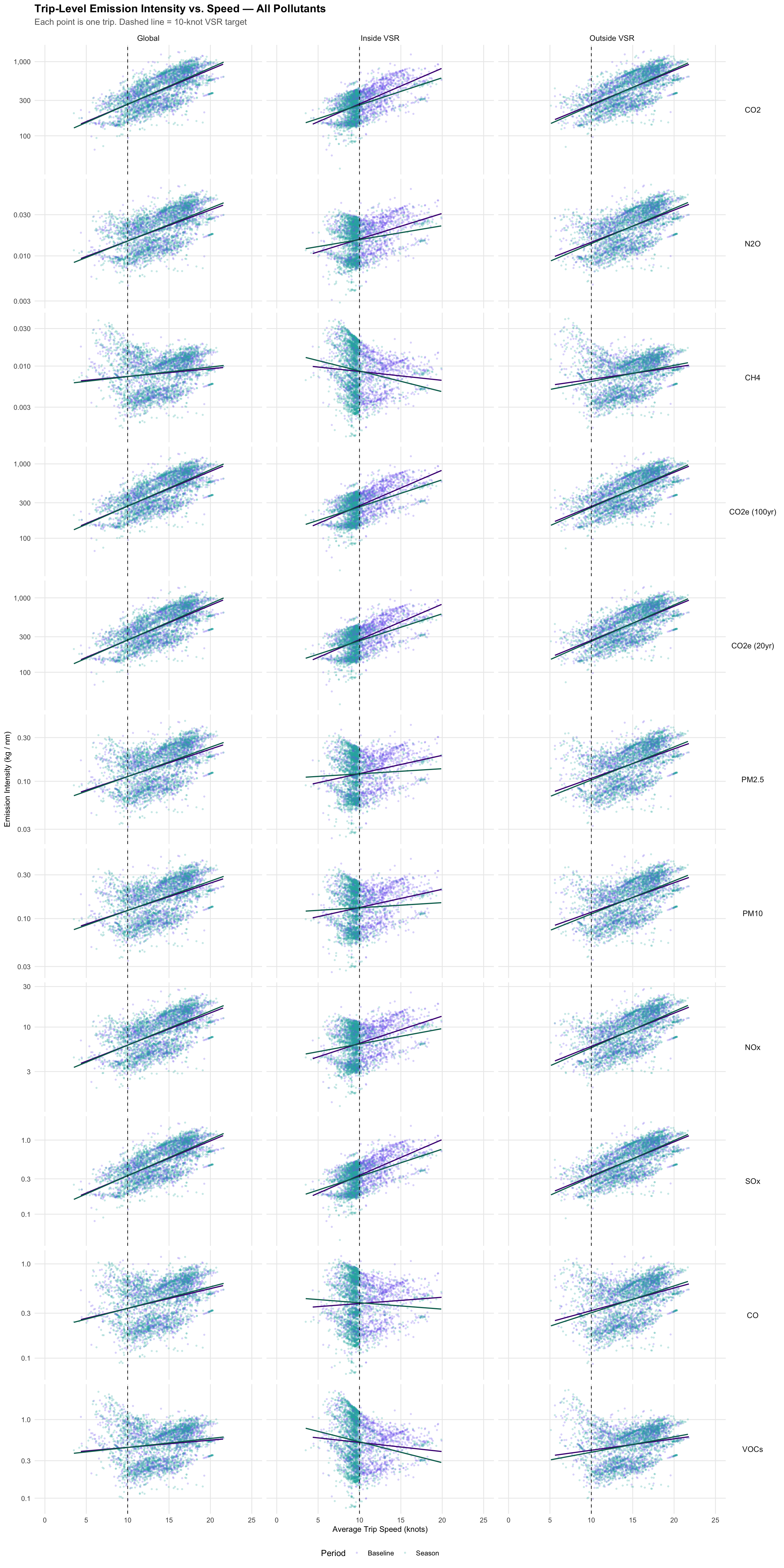
A.1.2 Trip-Level relationship
By exploring a lower level of aggregation (i.e., trip level), we obtain a higher resolution view of these relationships, where the distinction between CH4, VOCs and CO relative to the other pollutants becomes clearer (Figure A.6).
For CH4 and VOCs, we observe negative trends across both periods inside the VSR, along with a more dispersed relationship between intensity and speed, as these emissions lose the linearity between fuel consumption and emissions.
For the remaining pollutants, trends are less evident but can also be linked to the adjustment factors reported in Table A.1, with greater dispersion in the relationship for pollutants whose overall adjustment factors are larger compared to those for CO2 and SOx.
| Load Factor | CO2 | N2O | CH4 | PM | NOX | SOX | CO | VOCs |
|---|---|---|---|---|---|---|---|---|
| ≤ 2% | 1 | 4.63 | 21.18 | 7.29 | 4.63 | 1 | 9.68 | 21.18 |
| 3% | 1 | 2.92 | 11.68 | 4.33 | 2.92 | 1 | 6.46 | 11.68 |
| 4% | 1 | 2.21 | 7.71 | 3.09 | 2.21 | 1 | 4.86 | 7.71 |
| 5% | 1 | 1.83 | 5.61 | 2.44 | 1.83 | 1 | 3.89 | 5.61 |
| 6% | 1 | 1.60 | 4.35 | 2.04 | 1.60 | 1 | 3.25 | 4.35 |
| 7% | 1 | 1.45 | 3.52 | 1.79 | 1.45 | 1 | 2.79 | 3.52 |
| 8% | 1 | 1.35 | 2.95 | 1.61 | 1.35 | 1 | 2.45 | 2.95 |
| 9% | 1 | 1.27 | 2.52 | 1.48 | 1.27 | 1 | 2.18 | 2.52 |
| 10% | 1 | 1.22 | 2.20 | 1.38 | 1.22 | 1 | 1.96 | 2.20 |
| 11% | 1 | 1.17 | 1.96 | 1.30 | 1.17 | 1 | 1.79 | 1.96 |
| 12% | 1 | 1.14 | 1.76 | 1.24 | 1.14 | 1 | 1.64 | 1.76 |
| 13% | 1 | 1.11 | 1.60 | 1.19 | 1.11 | 1 | 1.52 | 1.60 |
| 14% | 1 | 1.08 | 1.47 | 1.15 | 1.08 | 1 | 1.41 | 1.47 |
| 15% | 1 | 1.06 | 1.36 | 1.11 | 1.06 | 1 | 1.32 | 1.36 |
| 16% | 1 | 1.05 | 1.26 | 1.08 | 1.05 | 1 | 1.24 | 1.26 |
| 17% | 1 | 1.03 | 1.18 | 1.06 | 1.03 | 1 | 1.17 | 1.18 |
| 18% | 1 | 1.02 | 1.11 | 1.04 | 1.02 | 1 | 1.11 | 1.11 |
| 19% | 1 | 1.01 | 1.05 | 1.02 | 1.01 | 1 | 1.05 | 1.05 |
| ≥ 20% | 1 | 1.00 | 1.00 | 1.00 | 1.00 | 1 | 1.00 | 1.00 |
This seems to confirm that the low load adjustment factors in the model, which attempt to account for incomplete combustion at low engine loads, are responsible for the increase in emissions of certain pollutants inside the VSR zones during the speed reduction season. In fact, when examining percentage change by domain (Figure 3.2), the pollutants with increased emissions inside the VSR during the season are those associated with the highest low-load adjustment factors (CH4, VOCs, and CO), while emissions reductions are larger for those with no or smaller adjustments and decrease as adjustment factors increase. This further confirms that the patterns observed in the results section are driven by underlying combustion dynamics.
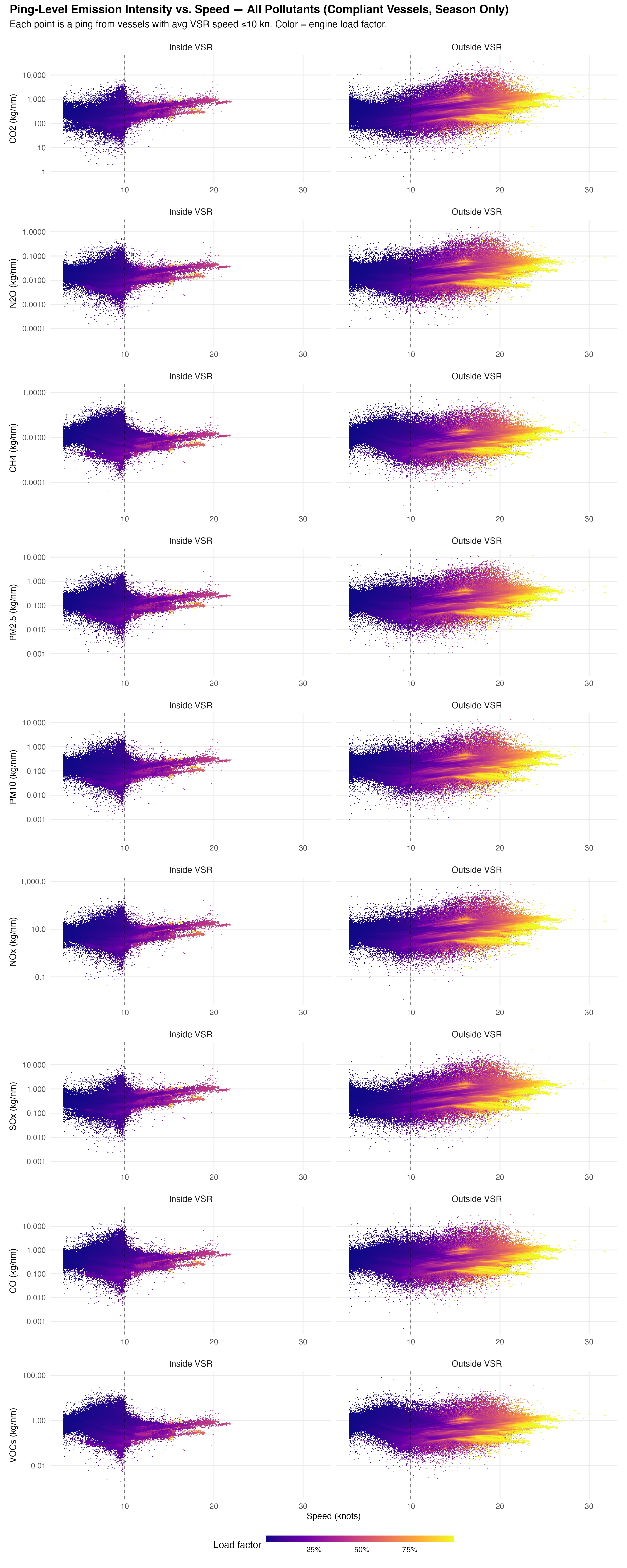
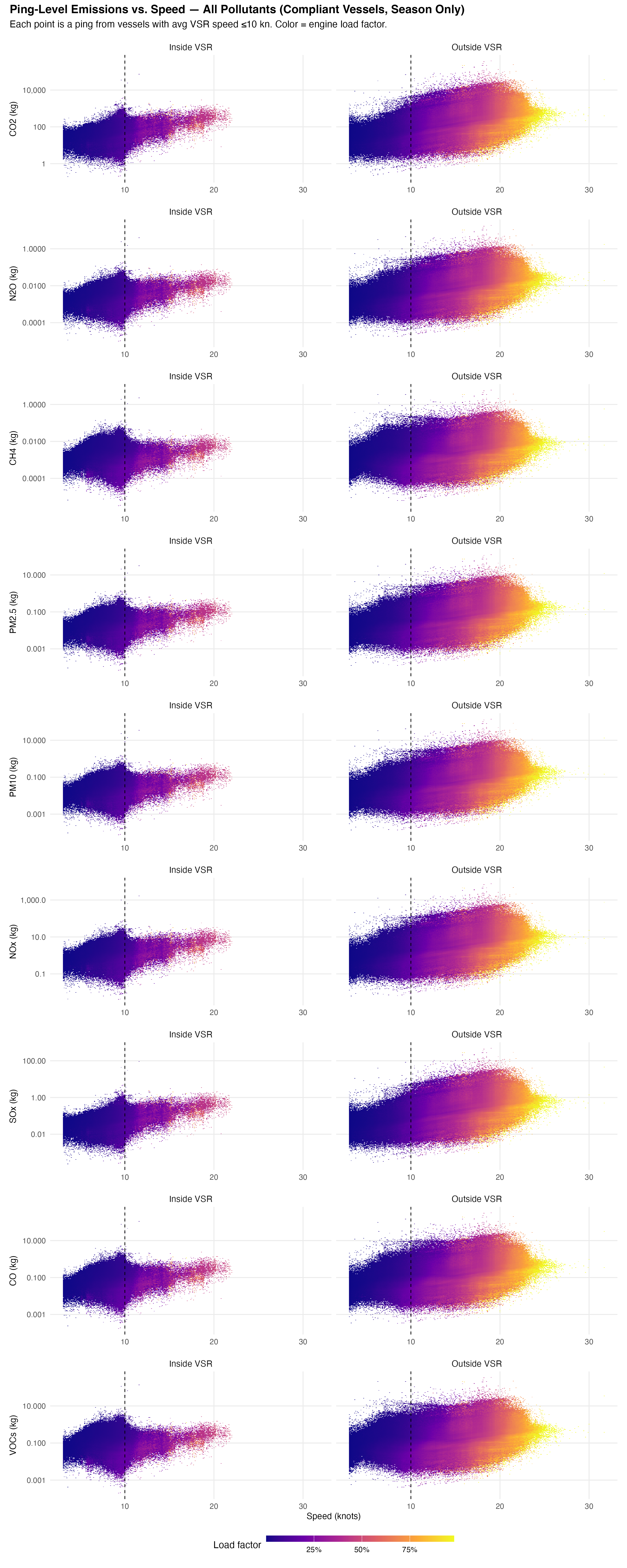
A.1.3 Ping-Level relationship
At the finest level of resolution, the individual AIS ping, we can clearly see the engine loads gradient, with the lowest loads generally occurring below the 10 knot target speed for all pollutants and across all domains, particularly inside the VSR zones, where loads are predominantly below 20% (Figure A.7, Figure A.8).
Note
These ping-level figures are pre-generated by r/generate_ping_figures.R to avoid memory constraints during rendering. Run that script first if the images below are missing.
A.2 Working Environment
This analysis uses the following infrastructure:
ocean-ghg-bwbs
  |__ docs              # Rendered documentation
  |__ qmd               # Quarto notebook files
  |__ data              # Input data (vessel lists, shapefiles)
  |__ sql               # BigQuery SQL queries
  |__ r                 # R functions and scripts
The analysis pipeline is built in R 4.5.0 using the {targets} package for reproducibility. Data is processed in Google BigQuery and downloaded locally for visualization. All resources can be found in this GitHub repository.