Plot Raster Data
Last updated on 2024-08-19 | Edit this page
Estimated time: 70 minutes
Overview
Questions
- How can I create categorized or customized maps of raster data?
- How can I customize the color scheme of a raster image?
- How can I layer raster data in a single image?
Objectives
- Build customized plots for a single band raster using the
ggplot2package. - Layer a raster dataset on top of a hillshade to create an elegant basemap.
Plot Raster Data in R
This episode covers how to plot a raster in R using the
ggplot2 package with customized coloring schemes. It also
covers how to layer a raster on top of a hillshade to produce an
eloquent map. We will continue working with the Digital Surface Model
(DSM) raster for the NEON Harvard Forest Field Site.
First, let’s load in the libraries and data we will need for this lesson:
R
library(terra)
library(ggplot2)
library(dplyr)

# DSM data for Harvard Forest
DSM_HARV <-
  rast("data/NEON-DS-Airborne-Remote-Sensing/HARV/DSM/HARV_dsmCrop.tif")

# If you are getting an error, check your file path:
# You might need change your file path to:
# "data/2009586/NEON-DS-Airborne-Remote-Sensing/HARV/DSM/HARV_dsmCrop.tif"

DSM_HARV_df <- as.data.frame(DSM_HARV, xy = TRUE)
Plotting Data Using Breaks
In the previous episode, we viewed our data using a continuous color
ramp. For clarity and visibility of the plot, we may prefer to view the
data “symbolized” or colored according to ranges of values. This is
comparable to a “classified” map. To do this, we need to tell
ggplot how many groups to break our data into, and where
those breaks should be. To make these decisions, it is useful to first
explore the distribution of the data using a bar plot. To begin with, we
will use dplyr’s mutate() function combined
with cut() to split the data into 3 bins.
R
DSM_HARV_df <- DSM_HARV_df %>%
                mutate(fct_elevation = cut(HARV_dsmCrop, breaks = 3))

ggplot() +
    geom_bar(data = DSM_HARV_df, mapping = aes(x = fct_elevation))
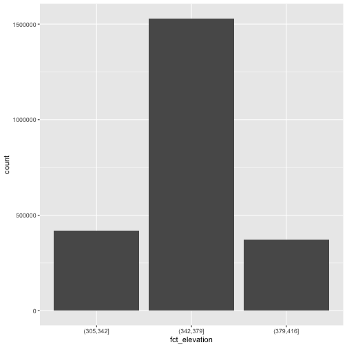
If we want to know the cutoff values for the groups, we can ask for
the unique values of fct_elevation:
R
unique(DSM_HARV_df$fct_elevation)
OUTPUT
[1] (379,416] (342,379] (305,342]
Levels: (305,342] (342,379] (379,416]
Notice that the cut() function shows closed intervals on
the right (]), and open intervals on the left
((). In our example, (305, 342] means that values greater
than 305 (but not 305 itself) and values less than or equal to 342 are
included in the interval.
And we can get the count of values in each group using
dplyr’s group_by() and count()
functions:
R
DSM_HARV_df %>%
  group_by(fct_elevation) %>%
  count() %>%
  ungroup()
OUTPUT
# A tibble: 3 × 2
  fct_elevation       n
  <fct>           <int>
1 (305,342]      418891
2 (342,379]     1530073
3 (379,416]      370835
We might prefer to customize the cutoff values for these groups. Lets
round the cutoff values so that we have groups for the ranges of 301–350
m, 351–400 m, and 401–450 m. To implement this we will give
mutate() a numeric vector of break points instead of the
number of breaks we want.
R
custom_bins <- c(300, 350, 400, 450)

DSM_HARV_df <- DSM_HARV_df %>%
  mutate(fct_elevation_2 = cut(HARV_dsmCrop, breaks = custom_bins))

unique(DSM_HARV_df$fct_elevation_2)
OUTPUT
[1] (400,450] (350,400] (300,350]
Levels: (300,350] (350,400] (400,450]
And now we can plot our bar plot again, using the new groups:
R
ggplot() +
  geom_bar(data = DSM_HARV_df, mapping = aes(x = fct_elevation_2))
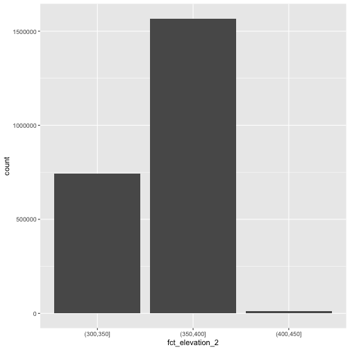
And we can get the count of values in each group in the same way we did before:
R
DSM_HARV_df %>%
  group_by(fct_elevation_2) %>%
  count() %>%
  ungroup()
OUTPUT
# A tibble: 3 × 2
  fct_elevation_2       n
  <fct>             <int>
1 (300,350]        741815
2 (350,400]       1567316
3 (400,450]         10668
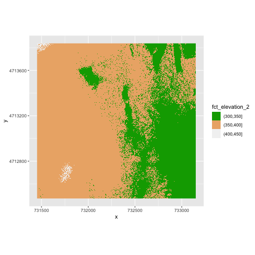
We can use those groups to plot our raster data, with each group being a different color:
R
ggplot() +
  geom_raster(data = DSM_HARV_df ,
              mapping = aes(x = x, y = y, fill = fct_elevation_2)) +
  coord_quickmap()
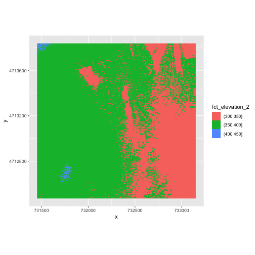
The plot above uses the default colors inside ggplot for
raster objects. We can specify our own colors to make the plot look a
little nicer. R has a built in set of colors for plotting terrain, which
are built in to the terrain.colors() function. Since we
have three bins, we want to create a 3-color palette:
R
terrain.colors(3)
OUTPUT
[1] "#00A600" "#ECB176" "#F2F2F2"The terrain.colors() function returns hex
colors - each of these character strings represents a color. To use
these in our map, we pass them across using the
scale_fill_manual() function.
R
ggplot() +
 geom_raster(data = DSM_HARV_df ,
             mapping = aes(x = x, y = y, fill = fct_elevation_2)) +
    scale_fill_manual(values = terrain.colors(3)) +
    coord_quickmap()
More Plot Formatting
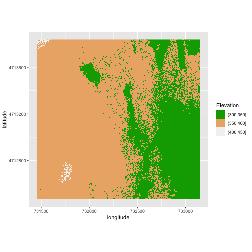
If we need to create multiple plots using the same color palette, we
can create an R object (my_col) for the set of colors that
we want to use. We can then quickly change the palette across all plots
by modifying the my_col object, rather than each individual
plot.
We can label the x- and y-axes of our plot too using the
labs() function. We can also give the legend a more
meaningful title by passing either a value to the name
argument of the scale_fill_manual() function or by
specifying it within the labs() function as
fill = "name here".
R
my_col <- terrain.colors(3)

ggplot() +
 geom_raster(data = DSM_HARV_df ,
             mapping = aes(x = x, y = y, fill = fct_elevation_2)) +
  scale_fill_manual(values = my_col) +
  coord_quickmap() +
  labs(x = "longitude",
       y = "latitude",
       fill = "Elevation")
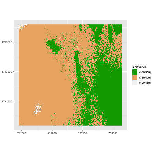
Or we can also turn off the labels of both axes by passing a NULL
value to the labs() function for the x and y values.
R
ggplot() +
 geom_raster(data = DSM_HARV_df ,
             mapping = aes(x = x, y = y, fill = fct_elevation_2)) +
  scale_fill_manual(values = my_col) +
  coord_quickmap() +
  labs(x = NULL,
       y = NULL,
       fill = "Elevation")
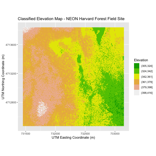
Challenge 1: Plot Using Custom Breaks
Create a plot of the Harvard Forest Digital Surface Model (DSM) that has:
- Six classified ranges of values (break points) that are evenly divided among the range of pixel values.
- Axis labels.
- A plot title. (You can specify this in the
labs()function as well, usingtitle = "Title here")
R
DSM_HARV_df <- DSM_HARV_df  %>%
               mutate(fct_elevation_6 = cut(HARV_dsmCrop, breaks = 6))

 my_col <- terrain.colors(6)

ggplot() +
    geom_raster(data = DSM_HARV_df,
                mapping = aes(x = x, y = y, fill = fct_elevation_6)) +
    scale_fill_manual(values = my_col) +
    labs(x = "UTM Easting Coordinate (m)",
         y = "UTM Northing Coordinate (m)",
         fill = "Elevation",
         title = "Classified Elevation Map - NEON Harvard Forest Field Site") +
    coord_quickmap()
Layering Rasters
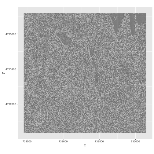
We can layer a raster on top of a hillshade raster for the same area, and use a transparency factor to create a 3-dimensional shaded effect. A hillshade is a raster that maps the shadows and texture that you would see from above when viewing terrain. We will add a custom color, making the plot grey.
First we need to read in our DSM hillshade data and view the structure:
R
DSM_hill_HARV <-
  rast("data/NEON-DS-Airborne-Remote-Sensing/HARV/DSM/HARV_DSMhill.tif")

# If you are getting an error, check your file path:
# You might need change your file path to:
# "data/2009586/NEON-DS-Airborne-Remote-Sensing/HARV/DSM/HARV_DSMhill.tif"

DSM_hill_HARV
OUTPUT
class       : SpatRaster
dimensions  : 1367, 1697, 1  (nrow, ncol, nlyr)
resolution  : 1, 1  (x, y)
extent      : 731453, 733150, 4712471, 4713838  (xmin, xmax, ymin, ymax)
coord. ref. : WGS 84 / UTM zone 18N (EPSG:32618)
source      : HARV_DSMhill.tif
name        : HARV_DSMhill
min value   :   -0.7136298
max value   :    0.9999997
Next we convert it to a dataframe, so that we can plot it using
ggplot2:
R
DSM_hill_HARV_df <- as.data.frame(DSM_hill_HARV, xy = TRUE)

str(DSM_hill_HARV_df)
OUTPUT
'data.frame':	2313675 obs. of  3 variables:
 $ x           : num  731454 731456 731456 731458 731458 ...
 $ y           : num  4713836 4713836 4713836 4713836 4713836 ...
 $ HARV_DSMhill: num  -0.15567 0.00743 0.86989 0.9791 0.96283 ...
Now we can plot the hillshade data. Note that the alpha
object translates to transparency, where a value of 0 indicates fully
transparent and a value of 1 indicates fully opaque. We can force R to
not show the legend for a particular scale if we use
guide = "none":
R
ggplot() +
  geom_raster(data = DSM_hill_HARV_df,
              mapping = aes(x = x, y = y, alpha = HARV_DSMhill)) +
  scale_alpha(range =  c(0.15, 0.65), guide = "none") +
  coord_quickmap()
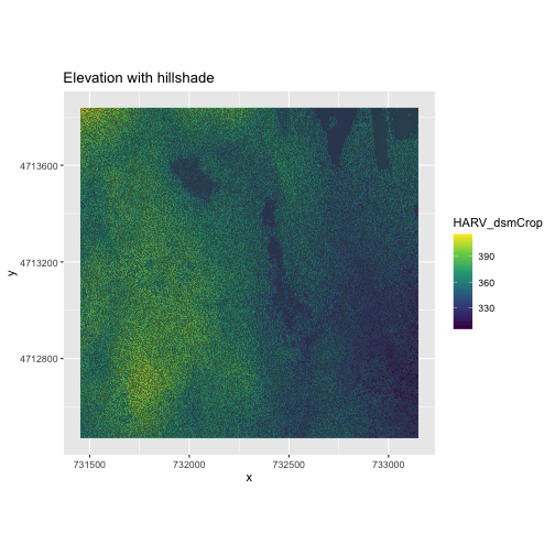
We can layer another raster on top of our hillshade by adding another
call to the geom_raster() function. Let’s overlay
DSM_HARV on top of the hill_HARV. We can also
add a title to our plot within the labs() function using
labs(title = "Plot title") or we can use
ggtitle("Plot title").
R
ggplot() +
  geom_raster(data = DSM_HARV_df,
              mapping = aes(x = x, y = y, fill = HARV_dsmCrop)) +
  geom_raster(data = DSM_hill_HARV_df,
              mapping = aes(x = x, y = y, alpha = HARV_DSMhill)) +
  scale_fill_viridis_c() +
  scale_alpha(range = c(0.15, 0.65), guide = "none") +
  labs(title = "Elevation with hillshade") +
  coord_quickmap()
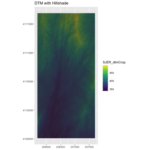
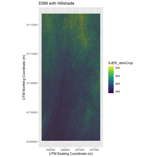
Challenge 2: Create DTM & DSM for SJER
Use the files in the
data/NEON-DS-Airborne-Remote-Sensing/SJER/ (or
data/2009586/NEON-DS-Airborne-Remote-Sensing/SJER/
depending on your setup) directory to create a Digital Terrain Model map
and Digital Surface Model map of the San Joaquin Experimental Range
field site.
Make sure to:
- include hillshade in the maps,
- label axes on the DSM map and exclude them from the DTM map,
- include a title for each map,
- experiment with various alpha values and color palettes to represent the data.
R
# CREATE DSM MAPS

# import DSM data
DSM_SJER <-
  rast("data/NEON-DS-Airborne-Remote-Sensing/SJER/DSM/SJER_dsmCrop.tif")

# If you are getting an error, check your file path:
# You might need change your file path to:
# "data/2009586/NEON-DS-Airborne-Remote-Sensing/SJER/DSM/SJER_dsmCrop.tif"

# convert to a df for plotting
DSM_SJER_df <- as.data.frame(DSM_SJER, xy = TRUE)

# import DSM hillshade
DSM_hill_SJER <-
  rast("data/NEON-DS-Airborne-Remote-Sensing/SJER/DSM/SJER_dsmHill.tif")

# If you are getting an error, check your file path:
# You might need change your file path to:
# "data/2009586/NEON-DS-Airborne-Remote-Sensing/SJER/DSM/SJER_dsmHill.tif"

# convert to a df for plotting
DSM_hill_SJER_df <- as.data.frame(DSM_hill_SJER, xy = TRUE)

# Build Plot
ggplot() +
    geom_raster(data = DSM_SJER_df ,
                mapping = aes(x = x, y = y,
                              fill = SJER_dsmCrop), alpha = 0.8) +
    geom_raster(data = DSM_hill_SJER_df,
                mapping = aes(x = x, y = y, alpha = SJER_dsmHill)) +
    scale_fill_viridis_c() +
    scale_alpha(range = c(0.4, 0.7), guide = "none") +
    labs(x = "UTM Easting Coordinate (m)",
         y = "UTM Northing Coordinate (m)",
         title = "DSM with Hillshade") +
    coord_quickmap()
R
# CREATE DTM MAP
# import DTM
DTM_SJER <-
  rast("data/NEON-DS-Airborne-Remote-Sensing/SJER/DTM/SJER_dtmCrop.tif")

# If you are getting an error, check your file path:
# You might need change your file path to:
# "data/2009586/NEON-DS-Airborne-Remote-Sensing/SJER/DTM/SJER_dtmCrop.tif"

DTM_SJER_df <- as.data.frame(DTM_SJER, xy = TRUE)

# DTM Hillshade
DTM_hill_SJER <-
  rast("data/NEON-DS-Airborne-Remote-Sensing/SJER/DTM/SJER_dtmHill.tif")

# If you are getting an error, check your file path:
# You might need change your file path to:
# "data/2009586/NEON-DS-Airborne-Remote-Sensing/SJER/DTM/SJER_dtmHill.tif"

DTM_hill_SJER_df <- as.data.frame(DTM_hill_SJER, xy = TRUE)

ggplot() +
    geom_raster(data = DTM_SJER_df,
                mapping = aes(x = x, y = y,
                              fill = SJER_dtmCrop),
                              alpha = 2.0) +
    geom_raster(data = DTM_hill_SJER_df,
                mapping = aes(x = x, y = y,
                              alpha = SJER_dtmHill)) +
    scale_fill_viridis_c() +
    scale_alpha(range = c(0.4, 0.7), guide = "none") +
    labs(x = NULL,
         y = NULL,
         title = "DTM with Hillshade") +
    coord_quickmap()
