Create Publication-quality Graphics
Last updated on 2024-08-19 | Edit this page
Overview
Questions
- How can I deal with multiple raster layers?
- How can I create a publication-quality graphic and customize plot parameters?
Objectives
- Create a raster stack
- Assign custom names to bands in a RasterStack.
- Customize raster plots using the
ggplot2package.
This episode covers how to customize your raster plots using the
ggplot2 package in R to create publication-quality
plots.
First, let’s load the libraries that we will need for this episode.
We will be using the tidyr package in this episode,
which you might not have used yet!
If you haven’t downloaded tidyr to your R yet, do so now
using:
install.packages("tidyr")
Once it’s downloaded, load in all the packages for this episode:
R
library(terra)
library(ggplot2)
library(dplyr)
library(tidyr)
Faceting plots
There may come a time when you will need to plot several smaller plots within a larger plot. The result is a plot with facets. These plots can be useful if you have several variables that you want to show at once, or if you’re trying to look at maps over time.
We have a time series of raster data that are spread across several files. These data show the normalized difference vegetation index (NDVI) from the Harvard Forest Site. We can best visualize these data by using facets. To do this, we need to read the data in as a “raster stack”.
First, let’s get the list of all the raster files in our time series.
We can do this using the list.files() function. We will
only add files that have a .tif extension to our list. To do this, we
will use the syntax pattern=".tif$". If we specify
full.names = TRUE, the full path for each file will be
added to the list.
R
NDVI_HARV_path <- "data/NEON-DS-Landsat-NDVI/HARV/2011/NDVI"

all_NDVI_HARV <- list.files(NDVI_HARV_path,
                            full.names = TRUE,
                            pattern = ".tif$")

# If you are getting an error, check your file path:
# You might need change your file path to:
# "data/2009586/NEON-DS-Landsat-NDVI/HARV/2011/NDVI"
It’s a good idea to look at the file names that matched our search to make sure they meet our expectations.
R
all_NDVI_HARV
OUTPUT
 [1] "data/NEON-DS-Landsat-NDVI/HARV/2011/NDVI/005_HARV_ndvi_crop.tif"
 [2] "data/NEON-DS-Landsat-NDVI/HARV/2011/NDVI/037_HARV_ndvi_crop.tif"
 [3] "data/NEON-DS-Landsat-NDVI/HARV/2011/NDVI/085_HARV_ndvi_crop.tif"
 [4] "data/NEON-DS-Landsat-NDVI/HARV/2011/NDVI/133_HARV_ndvi_crop.tif"
 [5] "data/NEON-DS-Landsat-NDVI/HARV/2011/NDVI/181_HARV_ndvi_crop.tif"
 [6] "data/NEON-DS-Landsat-NDVI/HARV/2011/NDVI/197_HARV_ndvi_crop.tif"
 [7] "data/NEON-DS-Landsat-NDVI/HARV/2011/NDVI/213_HARV_ndvi_crop.tif"
 [8] "data/NEON-DS-Landsat-NDVI/HARV/2011/NDVI/229_HARV_ndvi_crop.tif"
 [9] "data/NEON-DS-Landsat-NDVI/HARV/2011/NDVI/245_HARV_ndvi_crop.tif"
[10] "data/NEON-DS-Landsat-NDVI/HARV/2011/NDVI/261_HARV_ndvi_crop.tif"
[11] "data/NEON-DS-Landsat-NDVI/HARV/2011/NDVI/277_HARV_ndvi_crop.tif"
[12] "data/NEON-DS-Landsat-NDVI/HARV/2011/NDVI/293_HARV_ndvi_crop.tif"
[13] "data/NEON-DS-Landsat-NDVI/HARV/2011/NDVI/309_HARV_ndvi_crop.tif"
Now we have a list of all GeoTIFF files in the NDVI directory for
Harvard Forest. The number at the start of the filenames represents the
julilan day. Next, we will create a stack of rasters from this list
using the rast() function. This is the same function we use
to read in any raster file.
R
NDVI_HARV_stack <- rast(all_NDVI_HARV)
NDVI_HARV_stack
OUTPUT
class       : SpatRaster
dimensions  : 5, 4, 13  (nrow, ncol, nlyr)
resolution  : 30, 30  (x, y)
extent      : 239415, 239535, 4714215, 4714365  (xmin, xmax, ymin, ymax)
coord. ref. : UTM Zone 19, Northern Hemisphere
sources     : 005_HARV_ndvi_crop.tif
              037_HARV_ndvi_crop.tif
              085_HARV_ndvi_crop.tif
              ... and 10 more source(s)
names       : 005_H~_crop, 037_H~_crop, 085_H~_crop, 133_H~_crop, 181_H~_crop, 197_H~_crop, ...
min values  :        2732,        1534,        1917,        5669,        8685,        8768, ...
max values  :        5545,        3736,        3600,        6394,        8903,        9140, ...
We can see from looking that the data that we will need to scale the values. NDVI data should be a value between 0 and 1 (and it’s currently a value between 0 and 10,000!):
R
NDVI_HARV_stack <- NDVI_HARV_stack/10000
Once we have created our RasterStack, we can visualize our data. We
can use the ggplot() command to create a multi-panelled
plot showing each band in our RasterStack. First we need to create a
data frame object. Because there are multiple columns in our data that
are not variables, we will tidy (or “pivot”) the data so that we have a
single column with the NDVI observations. We will use the function
pivot_longer() from the tidyr package to do
this. Since there are so many columns with relevant data, instead of
specifying the columns we want to pivot, we can specify the columns we
don’t want to pivot instead. We do this by specifying
cols = -(x:y):
R
NDVI_HARV_stack_df <- as.data.frame(NDVI_HARV_stack, xy = TRUE) %>%
    pivot_longer(cols = -(x:y), names_to = "variable", values_to = "value")
Now we can plot our data using ggplot(). We want to
create a separate panel for each time point in our time series, so we
will use the facet_wrap() function to create a
multi-paneled plot by the variable column:
R
ggplot() +
  geom_raster(data = NDVI_HARV_stack_df,
              mapping = aes(x = x, y = y, fill = value)) +
  facet_wrap(~variable)
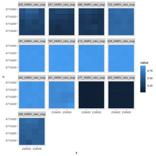
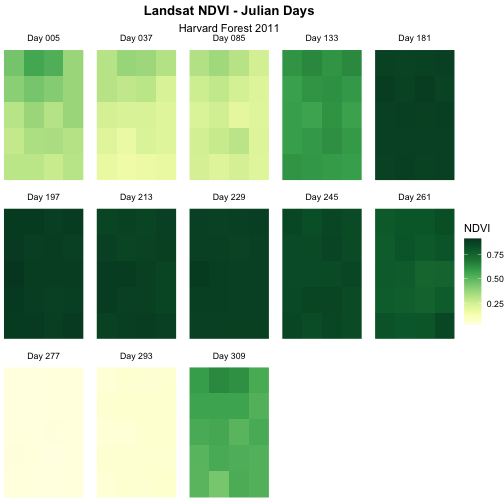
Although this plot is informative, it isn’t something we would expect to see in a journal publication. The x and y-axis labels aren’t informative. There is a lot of unnecessary gray background and the titles of each panel don’t clearly state that the number refers to the Julian day the data was collected. In this episode, we will customize this plot above to produce a publication quality graphic. We will go through these steps iteratively. When we’re done, we will have created the plot shown below.
Adjust the Plot Theme
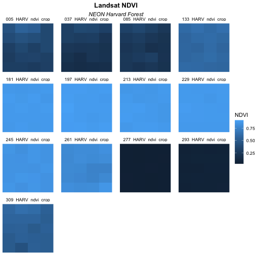
The first thing we will do to our plot remove the x and y-axis labels
and axis ticks, as these are unnecessary and make our plot look messy.
We can do this by using a pre-set ggplot theme that
simplifies all plot parameters. We will add the function
theme_void() to tell ggplot that we want to
use this theme.
R
ggplot() +
  geom_raster(data = NDVI_HARV_stack_df,
              mapping = aes(x = x, y = y, fill = value)) +
  facet_wrap(~variable) +
  labs(title = "Landsat NDVI",
       subtitle = "NEON Harvard Forest",
       fill = "NDVI") +
  theme_void()

Next we will center our plot title and subtitle. We need to do this
after the theme_void() layer, because R
interprets the ggplot layers in order. If we first tell R
to center our plot title, and then set the theme to void,
any adjustments we’ve made to the plot theme will be over-written by the
theme_void() function. So first we make the theme
void and then we center the title. We center both the title
and subtitle by using the theme() function and setting the
hjust parameter to 0.5. The hjust parameter
stands for “horizontal justification” and takes any value between 0 and
1. A setting of 0 indicates left justification and a setting of 1
indicates right justification. We can also update the “face” of the
font, to be bold or italics, or bold and italics. To do this, we would
adjust the face parameter.
R
ggplot() +
  geom_raster(data = NDVI_HARV_stack_df,
              mapping = aes(x = x, y = y, fill = value)) +
  facet_wrap(~variable) +
  labs(title = "Landsat NDVI",
       subtitle = "NEON Harvard Forest",
       fill = "NDVI") +
  theme_void() +
  theme(plot.title = element_text(hjust = 0.5, face = "bold"),
        plot.subtitle = element_text(hjust = 0.5))

Challenge 1
Change the plot subtitle to italic font. You can (and should!) use the help menu in RStudio or any internet resources to figure out how to change this setting.
Hint: Use ?element_text() to pull up the help
file and see how you might be able to change the appearance of text in
the theme() function.
Learners can find this information in the help files for the
theme() function. The parameter to set is called
face.
R
ggplot() +
  geom_raster(data = NDVI_HARV_stack_df,
              mapping = aes(x = x, y = y, fill = value)) +
  facet_wrap(~variable) +
  labs(title = "Landsat NDVI",
       subtitle = "NEON Harvard Forest",
       fill = "NDVI") +
  theme_void() +
  theme(plot.title = element_text(hjust = 0.5, face = "bold"),
        plot.subtitle = element_text(hjust = 0.5, face = "italic"))
Adjust the Color Ramp
Next, let’s adjust the color ramp used to render the rasters. First,
we can change the blue color ramp to a green one that is more visually
suited to our NDVI (greenness) data using the
colorRampPalette() function in combination with
colorBrewer which requires loading the
RColorBrewer library.
If you don’t have the RColorBrewer library yet, install
it using:
install.packages("RColorBrewer")
Now we need to create a set of colors to use.
We can view the palettes available in RColorBrewer:
R
library(RColorBrewer)

display.brewer.all()
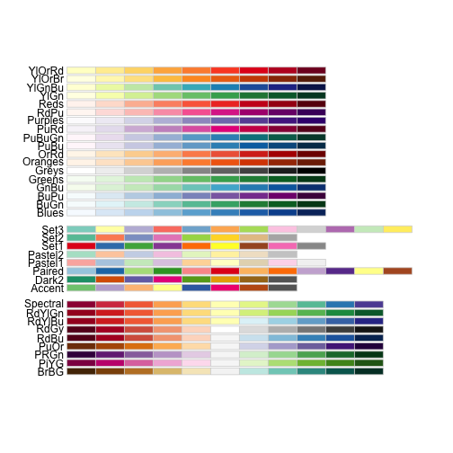
We will select a set of nine colors from the “YlGn” (yellow-green) color palette. This returns a set of hex color codes:
R
brewer.pal(9, "YlGn")
OUTPUT
[1] "#FFFFE5" "#F7FCB9" "#D9F0A3" "#ADDD8E" "#78C679" "#41AB5D" "#238443"
[8] "#006837" "#004529"
We can save these colors to add to our plot later.
R
green_colors <- brewer.pal(9, "YlGn")
Now we can go ahead and build our plot!
R
ggplot() +
  geom_raster(data = NDVI_HARV_stack_df,
              mapping = aes(x = x, y = y, fill = value)) +
  facet_wrap(~variable) +
  scale_fill_gradientn(colours = green_colors) +
  labs(title = "Landsat NDVI",
       subtitle = "NEON Harvard Forest",
       fill = "NDVI") +
  theme_void() +
  theme(plot.title = element_text(hjust = 0.5, face = "bold"),
        plot.subtitle = element_text(hjust = 0.5))

The yellow to green color ramp visually represents NDVI well given it’s a measure of greenness. Someone looking at the plot can quickly understand that pixels that are more green have a higher NDVI value.
Data Tip
For all of the brewer.pal ramp names see the brewerpal
page.
Data Tip
Cynthia Brewer, the creator of ColorBrewer, offers an online tool to help choose suitable color ramps, or to create your own. ColorBrewer 2.0; Color Advise for Cartography
Refine Plot & Tile Labels
Next, let’s label each panel in our plot with the Julian day that the
raster data for that panel was collected. The current names come from
the band “layer names” stored in the RasterStack and the
first part of each name is the Julian day.
To create a more meaningful label we can remove the pieces of the
label we don’t want and replace it with something we do by using the
gsub() function in R. The syntax is as follows:
gsub("StringToReplace", "TextToReplaceIt", object).
First let’s remove “_HARV_NDVI_crop” from each label to make the
labels shorter and remove repetition. To illustrate how this works, we
will first look at the names for our NDVI_HARV_stack_df
object in the variable column:
R
unique(NDVI_HARV_stack_df$variable)
OUTPUT
 [1] "005_HARV_ndvi_crop" "037_HARV_ndvi_crop" "085_HARV_ndvi_crop"
 [4] "133_HARV_ndvi_crop" "181_HARV_ndvi_crop" "197_HARV_ndvi_crop"
 [7] "213_HARV_ndvi_crop" "229_HARV_ndvi_crop" "245_HARV_ndvi_crop"
[10] "261_HARV_ndvi_crop" "277_HARV_ndvi_crop" "293_HARV_ndvi_crop"
[13] "309_HARV_ndvi_crop"
Now we will use the gsub() function to find the
character string “_HARV_ndvi_crop” and replace it with a blank string
(““). We will assign this output to a new column
(panel_name) using the mutate() function and
look at that column to sure our code is doing what we want it to.
R
NDVI_HARV_stack_df <- NDVI_HARV_stack_df %>%
  mutate(panel_name = gsub("_HARV_ndvi_crop", "", variable))

unique(NDVI_HARV_stack_df$panel_name)
OUTPUT
 [1] "005" "037" "085" "133" "181" "197" "213" "229" "245" "261" "277" "293"
[13] "309"
So far so good. Now let’s use the paste() function to
add the word “Day” in front of each of those numbers:
R
NDVI_HARV_stack_df <- NDVI_HARV_stack_df %>%
  mutate(panel_name = paste("Day", panel_name))

unique(NDVI_HARV_stack_df$panel_name)
OUTPUT
 [1] "Day 005" "Day 037" "Day 085" "Day 133" "Day 181" "Day 197" "Day 213"
 [8] "Day 229" "Day 245" "Day 261" "Day 277" "Day 293" "Day 309"
Our labels look good now. Let’s render our plot again. This time,
we’ll facet by the panel_name column.
R
ggplot() +
  geom_raster(data = NDVI_HARV_stack_df,
              mapping = aes(x = x, y = y, fill = value)) +
  facet_wrap(~panel_name) +
  scale_fill_gradientn(colours = green_colors) +
  labs(title = "Landsat NDVI",
       subtitle = "NEON Harvard Forest",
       fill = "NDVI") +
  theme_void() +
  theme(plot.title = element_text(hjust = 0.5, face = "bold"),
        plot.subtitle = element_text(hjust = 0.5))
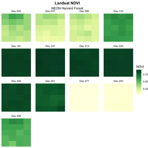
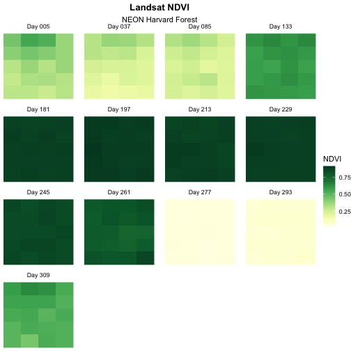
The “Day” looks a little bit cut off on our plots. We can fix that
using the “theme” again! This time, we will want to add something for
the strip.text area - let’s increase the margin on the
bottom of the text area to accommodate the text size. We can do this
using
theme(strip.text = element_text(margin = unit(c(0,0,2,0), "pt"))).
The c(0,0,2,0) tells us the new margins we want for the top
(0 pt), right (0 pt), bottom (2 pt), and left (0 pt) sides.
R
ggplot() +
  geom_raster(data = NDVI_HARV_stack_df,
              mapping = aes(x = x, y = y, fill = value)) +
  facet_wrap(~panel_name) +
  scale_fill_gradientn(colours = green_colors) +
  labs(title = "Landsat NDVI",
       subtitle = "NEON Harvard Forest",
       fill = "NDVI") +
  theme_void() +
  theme(plot.title = element_text(hjust = 0.5, face = "bold"),
        plot.subtitle = element_text(hjust = 0.5),
        strip.text = element_text(margin = unit(c(0,0,2,0), "pt")))
Change Layout of Panels
We can adjust the columns of our plot by setting the number of
columns ncol and the number of rows nrow in
facet_wrap. Let’s make our plot so that it has a width of
five panels.
R
ggplot() +
  geom_raster(data = NDVI_HARV_stack_df,
              mapping = aes(x = x, y = y, fill = value)) +
  facet_wrap(~panel_name, ncol = 5) +
  scale_fill_gradientn(colours = green_colors) +
  labs(title = "Landsat NDVI",
       subtitle = "NEON Harvard Forest",
       fill = "NDVI") +
  theme_void() +
  theme(plot.title = element_text(hjust = 0.5, face = "bold"),
        plot.subtitle = element_text(hjust = 0.5),
        strip.text = element_text(margin = unit(c(0,0,2,0), "pt")))
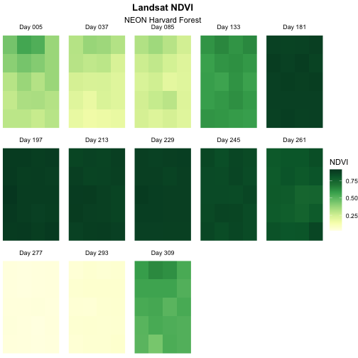
Now we have a beautiful, publication quality plot!
We can save this plot using the ggsave() function.
Remember that by default R will save the last rendered plot. We can
specify the height, width, and dpi for the figure when we save it. This
makes it super easy to meet your target journal’s figure formatting
requirements.
R
ggsave(filename = "figures/time_series_NDVI.png",
       height = 5, width = 5, dpi = 600)
Challenge 2: Divergent Color Ramps
When we used the paste() function to modify the tile
labels we replaced the beginning of each tile title with “Day”. A more
descriptive name could be “Julian Day”. Update the plot above with the
following changes:
- Label each tile “Julian Day” with the julian day value following.
- Change the color ramp to a divergent brown to green color ramp.
Questions: Does having a divergent color ramp represent the data better than a sequential color ramp (like “YlGn”)? Can you think of other data sets where a divergent color ramp may be best?
R
NDVI_HARV_stack_df <- NDVI_HARV_stack_df %>%
  mutate(panel_name = gsub("Day", "Julian Day", panel_name))

brown_green_colors <- brewer.pal(9, "BrBG")

ggplot() +
  geom_raster(data = NDVI_HARV_stack_df,
              mapping = aes(x = x, y = y, fill = value)) +
  facet_wrap(~panel_name, ncol = 5) +
  scale_fill_gradientn(colours = brown_green_colors) +
  labs(title = "Landsat NDVI - Julian Days",
       subtitle = "Harvard Forest 2011",
       fill = "NDVI") +
  theme_void() +
  theme(plot.title = element_text(hjust = 0.5, face = "bold"),
        plot.subtitle = element_text(hjust = 0.5),
        strip.text = element_text(margin = unit(c(0,0,2,0), "pt")))
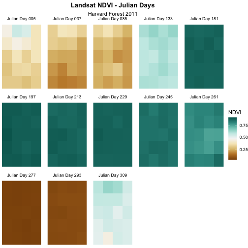
For NDVI data, the sequential color ramp is better than the divergent as it is more akin to the process of greening up, which starts off at one end and just keeps increasing.
Key Points
- Use the
theme_void()function for a clean background to your plot. - Use the
element_text()function to adjust text size, font, and position. - Use the
brewer.pal()function to create a custom color palette. - Use the
gsub()function to do pattern matching and replacement in text and thepaste()function to add to your current text.
